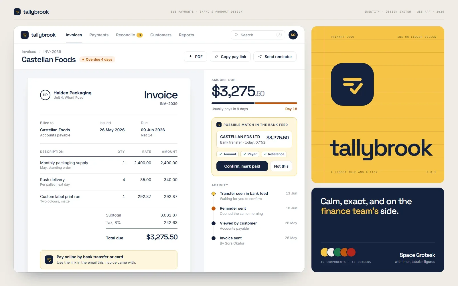
A brand and product system for a B2B payments platform.
Brand identity and product design for an invoicing and payments platform used by finance teams: one visual system carried from the logo through the product to the marketing site.
- Product screens
- 40
- Components in the library
- 46
- System for brand, product, and web
- 1
- Contrast on every colour pair
- AA
Tallybrook lets small finance teams send invoices, collect payments, and reconcile them in one place. We designed its brand and its product together, so that a company at an early stage looks and behaves like one its customers can trust with their money.
At a glance
- One visual system shared by the brand, the product, and the marketing site
- A design-token library so colour and type are defined once and used everywhere
- Around 40 product screens covering invoicing, payments, and reconciliation
- Every colour pair checked against WCAG AA contrast before approval
The problem worth solving
Finance software is bought on trust. The buyer is a controller or a finance lead who will be blamed if a payment goes missing, so the product has to feel exact before anyone reads a feature list. Early-stage products in this space tend to have the opposite problem: a logo from one place, an interface assembled from a component kit, and a website that matches neither.
Strategy first
The work started with positioning, not a moodboard. One sentence governs the identity: calm, exact, and on the finance team’s side. Each later choice was tested against it. A playful illustration style fails that test. A precise numeric typeface passes it.
The identity
The mark is built from a ledger rule and a tick, simple enough to hold up as a 16-pixel favicon. The palette is a deep ink navy for type and primary actions, a ledger yellow that marks what is selected, and a warm paper neutral for the interface. Status has its own three colours, and each one always appears with a word. Numbers are set in tabular figures so that columns of amounts align, which matters more in this product than any headline.
The product
Identity work that stops at a PDF does not ship. Here it continues directly into the interface:
- Invoices that read like documents, with status shown in words as well as colour
- A payments timeline that shows what has cleared, what is pending, and what failed, in that order of calm
- Reconciliation as a side-by-side match, where the system proposes and a person confirms
One library
Everything is assembled from one component library whose tokens mirror the brand guidelines, so the marketing site and the product cannot drift apart, and a new screen can be designed from existing parts.
What the design is built to move
Time for a new customer to send a first invoice, the share of support tickets caused by interface confusion, and how long it takes the team to design and ship a new screen.