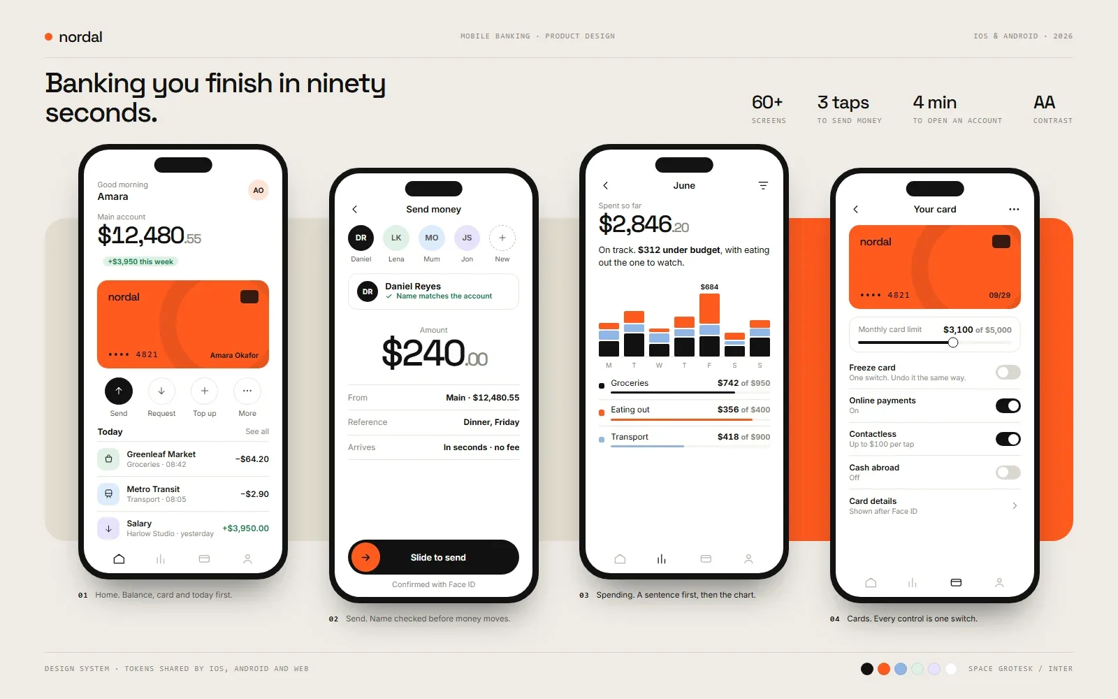
A mobile banking app designed around the first ninety seconds.
Product design for a digital bank: onboarding, the home screen, payments, card controls, and savings, each designed to be finished without thinking.
- Screens designed
- 60+
- To send money to a saved payee
- 3 taps
- Target time to open an account
- 4 min
- Contrast on every screen
- AA
Nordal is a mobile bank for people who are paid monthly and run their money from their phone. We designed the full product: identity check, accounts, cards, payments, and savings, to the standard people now expect from the best consumer finance apps.
At a glance
- A complete app design: onboarding, accounts, cards, payments, and savings
- One design system shared by iOS, Android, and the web
- Sending money to a saved payee in three taps, with the safety checks kept visible
- Every screen checked for WCAG AA contrast and tested with larger text sizes
The problem worth solving
People open a banking app many times a day, usually for under a minute, and almost always to answer one of three questions: how much do I have, what just left my account, and can I send this now. An app that answers those instantly earns trust. One that buries them under promotions loses it.
Everything in the design follows from that. The three answers are immediate, and everything else, from budgets to card limits, is reachable without getting in their way.
The home screen
The home screen shows the balance, the card, and today’s activity, and nothing else above the fold. Four actions sit under the card: send, request, top up, and more. Transactions are named the way a person would name them, with the merchant, the category, and the time, instead of a processor reference.
Speed and safety in the same flow
In payments, speed and safety pull in opposite directions. The design keeps both by making protection part of the flow instead of a wall in front of it. A new payee’s name is checked against the receiving account before any money moves, biometric confirmation replaces a typed code, and the confirmation screen states plainly what happened and when the money arrives.
The same thinking applies when something goes wrong. A declined payment is not an error code. It is an explanation, a question, and a way to reach a person.
Money that explains itself
Charts alone make people do arithmetic. The spending and savings screens report in sentences first: under budget by a stated amount, the one category to watch, how much round-ups have added this month. The chart is there to support the sentence.
Built to be built
The design is delivered as a token-based system: colour, type, spacing, and components defined once and mirrored in code, so a cross-platform build can share one library across both app stores and the web. Sensitive actions sit behind device biometrics throughout.
What the design is built to move
Completion rate of onboarding, time from install to a funded account, payment success rate, and the share of support contacts that begin with “where is my money”.